Overview
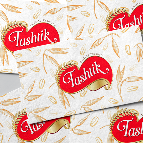
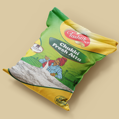
Tashtik is a traditional chakki atta brand rooted in quality, purity, and trust. When the brand came to us, it had strong values but lacked a cohesive visual language. Our goal was to modernize its identity without losing its desi charm or legacy feel. We developed a bold new logo using rich red and gold tones to reflect quality and authenticity, paired with a wheat motif that hints at the brand’s natural origins. The packaging was designed to appeal to Indian households, earthy greens and yellows give it a fresh, farm-to-kitchen vibe, while the hand-illustrated farmer adds credibility and cultural connection. From the visual structure to the text placement, every detail was aimed at making Tashtik feel familiar yet premium on both shelves and digital platforms.
Conclusion
Tashtik’s new identity strikes the right balance between trust and tradition. With bold visuals and thoughtful packaging design, the brand now stands confidently among household staples, looking as wholesome as the product it promises inside.

