Overview
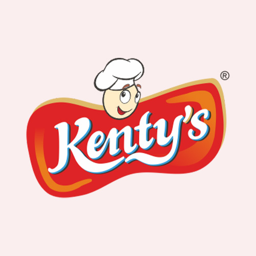
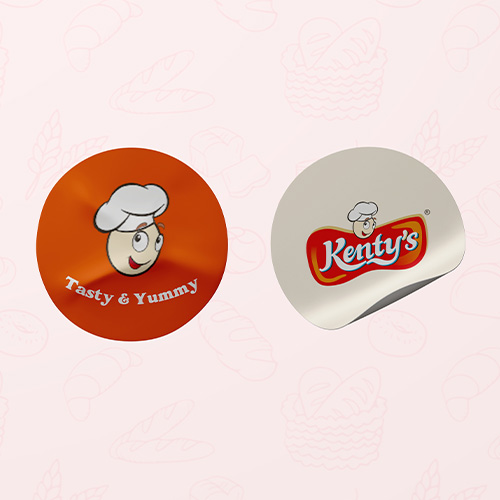
Kenty’s is a cheerful bakery brand crafted to bring warmth, joy, and great taste to every bite. When Kenty’s approached us, they had a clear vision a fun, lovable identity that connects instantly with families, kids, and bakery lovers alike. We built the brand around a charming mascot: a smiling egg chef with a toque, inspired by the heart of baking itself eggs. This character became the face of Kenty’s, making the brand instantly likable and easy to remember. The logo was carefully designed with bold, rounded typography that feels fresh, friendly, and full of personality. The visual identity extended into packaging with stickers and tags that are not only visually vibrant but also evoke the warmth and delight associated with bakery treats. We chose a bright orange and cream palette to suggest freshness, flavour, and happiness, aligning with the tagline “Tasty & Yummy.”
Conclusion
With a mascot-led identity and a clean, playful design system, Kenty’s stands out as a modern bakery brand that’s built for love at first sight. From the first look to the first bite, every element of the branding is designed to create smiles, spark cravings, and build brand recall that rises as beautifully as their baked goods.